.png)
- Project Name: Terminator: Future war (Hypothetical Sequel)
- Role: UX/UI Designer (Solo Designer)
- Tools Used: Figma,Photoshop,Photopea,Gameuidatabase,dribbble,Behance,
- Timeline: 3 Weeks
- Objective: Introduce a hypothetical UI concept for a sequel called Terminator: Future War.
The Terminator: Future War UI concept adds value by creating an immersive, retro-futuristic interface that enhances both gameplay and storytelling.
Challenges with the Existing UI from Terminator: Resistance:
- Cluttered HUD and Menus: Players found it difficult to quickly access mission-critical information and objectives during fast-paced combat situations.
- Weak Thematic Integration: The UI lacked cohesion with the gritty, dystopian tech-driven aesthetic of the Terminator universe, breaking immersion.
- Poor Visual Hierarchy: Essential gameplay data was often buried or visually overshadowed by less relevant UI elements, reducing usability under pressure.
- Limited Accessibility Options: The game offered minimal options for HUD scaling, colorblind modes, or UI customization, limiting usability for a diverse player base.
Why a Design for a Hypothetical Sequel?
- To create a cinematic, immersive, and faction-specific interface that supports storytelling and strengthens narrative worldbuilding.
- To enhance overall usability with streamlined menus, mission trackers, and clear tactical overlays for improved gameplay flow.
- To modernize the interface while staying true to the dystopian, war-torn visual identity of the Terminator universe, embracing Skynet-era design language.
Research Snapshot
The Problem
Terminator: Resistance UI felt cluttered, rigid, and disconnected from combat flow.
The Gap
Lack of modular HUD options, weak threat visibility, and poor console optimization.
The Goal
Design a modular, immersive HUD that feels Skynet-built but modern in usability.
Core Player
.png)
Tactical shooter players who value immersion, clarity, and adaptable combat interfaces.
What Players Expect
Clarity in Combat
Immediate visibility of health, threats, and objectives.
Immersive Aesthetic
Dark, retro-futuristic visuals aligned with the Terminator universe.
Flexibility
Scalable, customizable HUD elements for different play styles.
Competitive Benchmarking
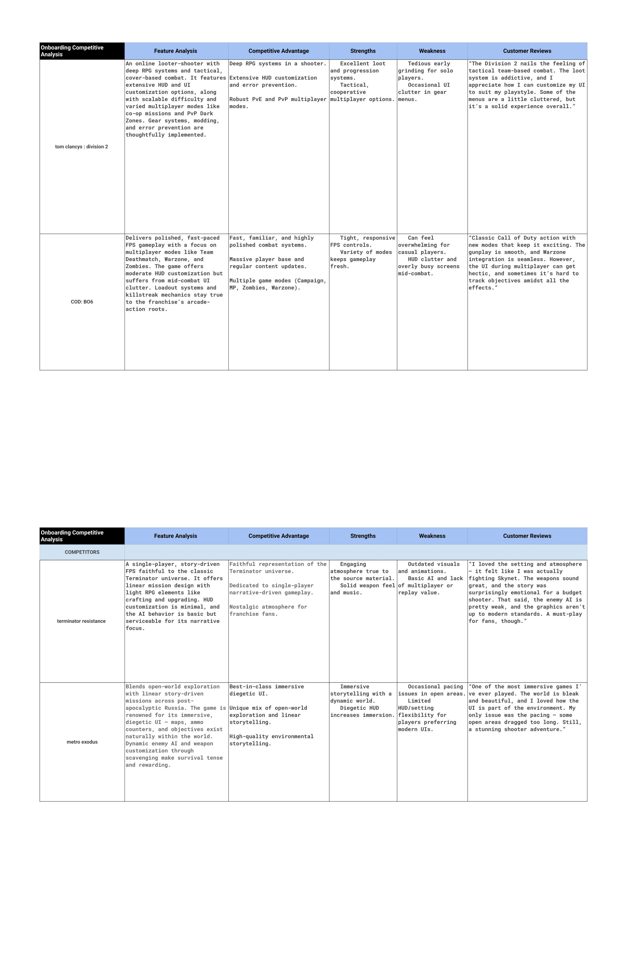
Division 2 sets the modular HUD standard. Metro Exodus excels in immersion. Black Ops 6 delivers readability. Terminator lacked adaptability and clarity.
What Changes
Design Improvements
- Modular HUD presets (Combat / Exploration)
- Enhanced threat visibility cues
- Controller-optimized menus
- Context-based UI fade behavior
User Outcomes
- Faster situational awareness
- Reduced cognitive load
- Improved immersion
- Higher player confidence mid-combat
Research & Evaluation
Heuristic evaluation identified gaps in visibility, flexibility, error prevention, and immersion consistency.
Design Challenge
The Balance
Preserve gritty Skynet aesthetics without sacrificing tactical clarity.
The Innovation
Translate modern shooter UX standards into a dystopian retro-future interface.
Wireframe & Design Evolution
High Fidelity
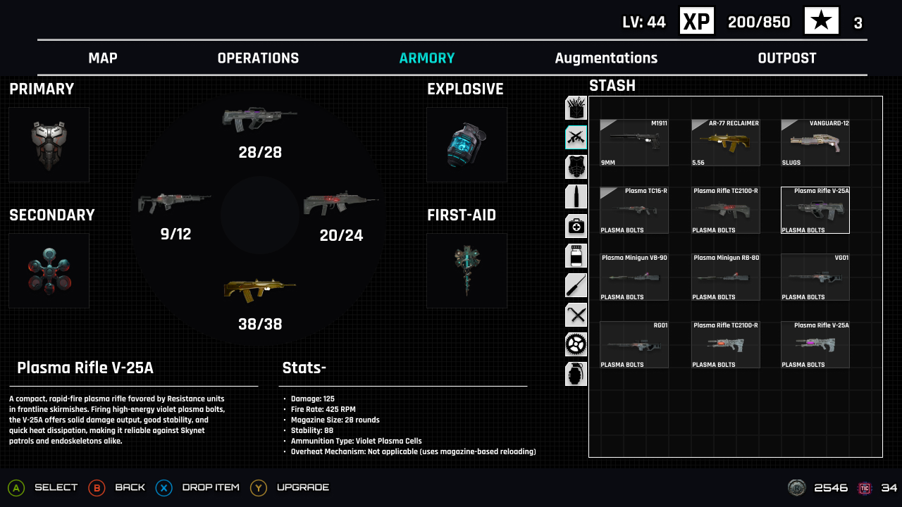
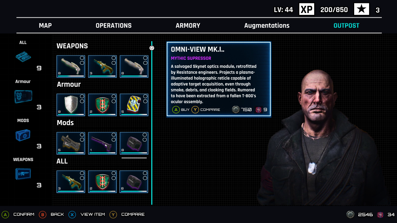
Using the feedback gathered from my competitive analysis and heuristic evaluations, I redesigned key inventory and vendor screens to address common player frustrations — like cluttered menus, poor threat visibility, and lack of intuitive item management. These high-fidelity prototypes showcase a modular, grid-based inventory system and streamlined vendor layout, maintaining the gritty, tech-heavy world of Terminator while improving clarity, quick item comparison, and ease of use in combat-heavy moments.
Iteration: First Concept vs. Final Design
My first layout missed the mark. It was too bright, cartoony, and clashed with the gritty Terminator aesthetic. The AI backgrounds, placeholder character, and mobile-style menus felt out of place. Colors and typography didn’t fit the brand. After feedback and comparing to Division 2 and Metro Exodus, I revised the design with a darker palette, clearer threat indicators, cleaner menus, and typography that matched the Skynet-era look.
Iteration: First Iteration vs. Final Iteration
.png)
.png)
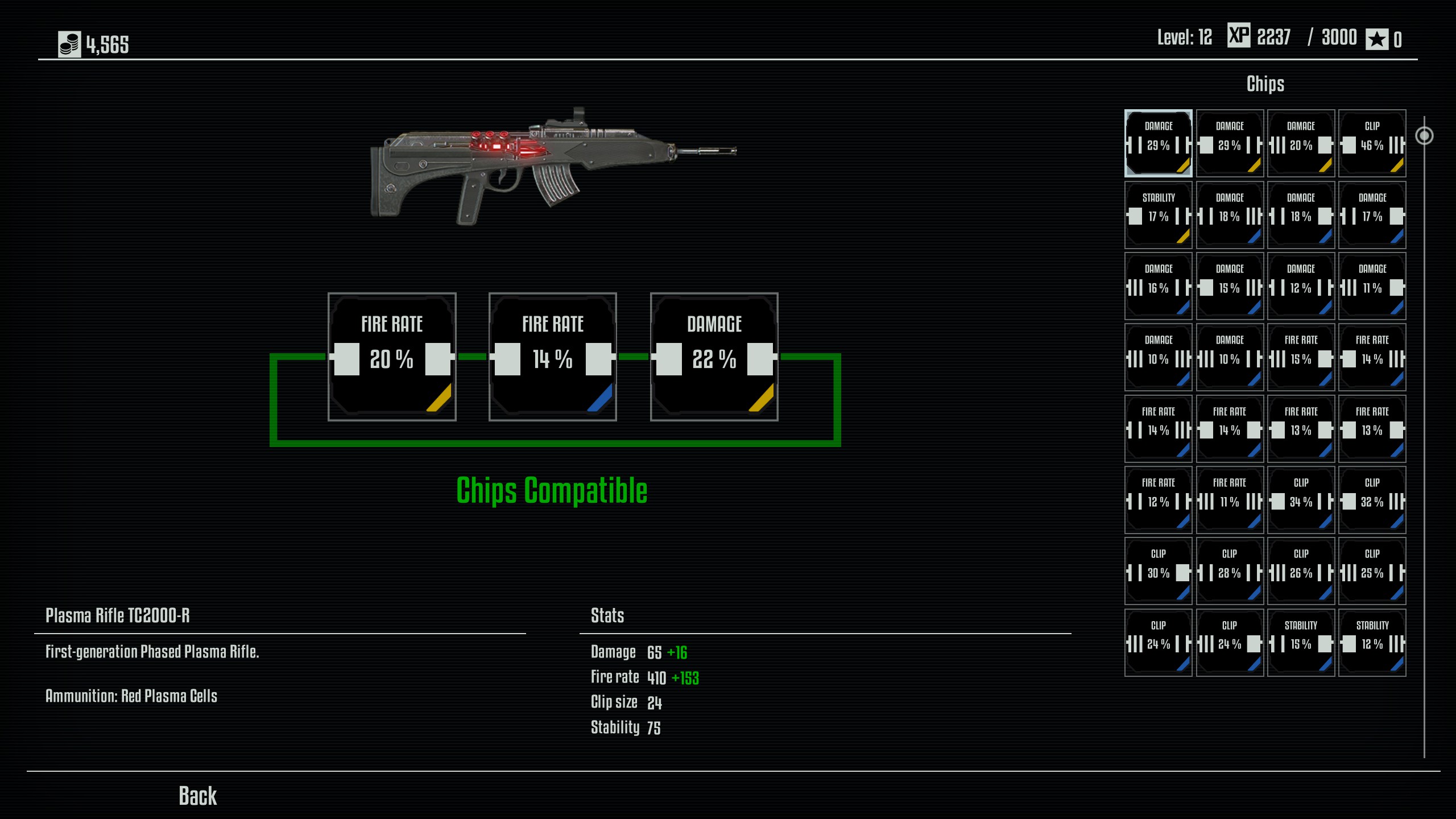
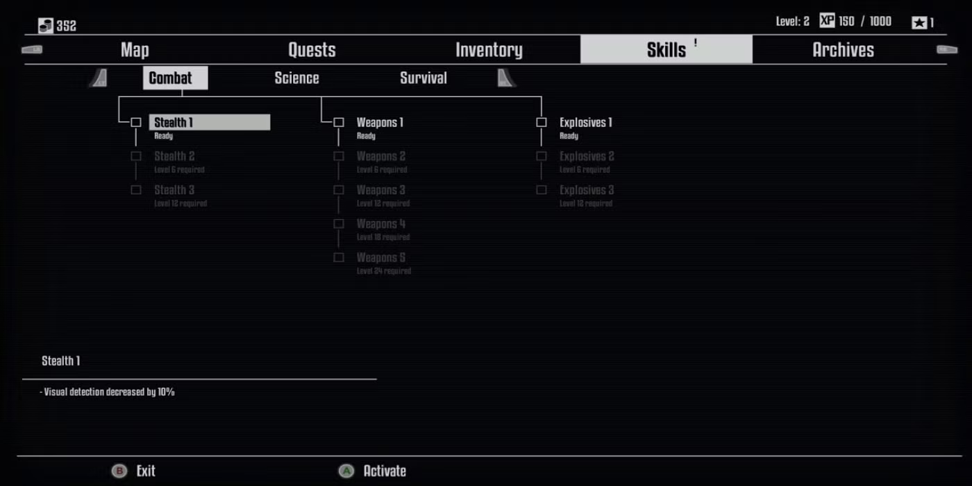
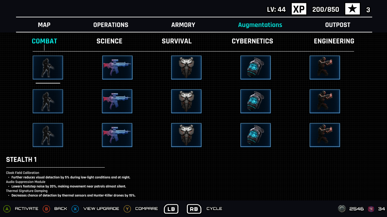
Terminator resistance vs Terminator future war
To see where improvements were made, I did a side-by-side comparison between the original Terminator: Resistance UI and my Future War redesign. The original used static layouts and a bland, slightly futuristic cybernetic style, while mine applied a Skynet-inspired color scheme with a blue hue from the Terminator’s eye socket, futuristic typography, and a clean, stylized header. The new full menu features Map, Operation, Armory, Augmentation, and Outpost, with icons designed in a futuristic, apocalyptic aesthetic to better fit the world’s tone.
What I Learned
- Immersion Can’t Sacrifice Usability: A HUD must enhance the game’s narrative and visual tone — but it must also support situational clarity, especially during high-intensity combat.
- Iterating Makes a Difference: My early concepts clashed with the Terminator theme. Through iteration and feedback comparisons with other games, I learned how small shifts in color, layout, or iconography drastically improve realism and cohesion.
- Design Without Feedback Requires Empathy: With no direct user testing, I relied on self-guided research, persona creation, and community forums to empathize with the player's pain points.
- Consistency Strengthens Brand Identity: Aligning typography, colors, and layout with Terminator’s lore made the design feel more authentic and grounded within the franchise’s world.
- Modularity Is Key in Combat Interfaces: The best shooter UIs adapt — from exploration to combat, from controller to mouse. Future interfaces must stay flexible, immersive, and clear at all times.