.png)
.jpg)
- Project Name: Universal Studios Website Redesign
- Role: UX/UI Designer (Solo Designer)
- Tools Used: Figma, Adobe XD, Photoshop, Google Drive/Docs, Coolors
- Timeline: 5 Weeks
- Objective: Enhance usability, navigation, and booking experience while modernizing the website's design for a seamless user journey.
The Universal Orlando website would benefit from a UX/UI redesign that creates an improved user experience through simple navigation while avoiding excessive text. The combination of visual cues and smooth interactions enables users to locate information easily, leading them through their journey without difficulty.
Problem Statement
Guests visiting the Universal Studios website struggle with a complex and outdated interface that makes it difficult to book tickets, find information, and navigate the site, especially on mobile devices. This negatively impacts user satisfaction and leads to high abandonment rates during critical booking and planning stages.
Identified Issues with the Current Universal Studios Website:
- Confusing Booking Process: Guests struggled to locate ticketing options and complete purchases efficiently, contributing to elevated cart abandonment rates.
- Overwhelming Navigation: Excessive menu items and poor content hierarchy made it difficult for users to quickly find information, increasing frustration and session drop-offs.
- Outdated Visual Design: Inconsistent branding, cluttered visuals, and weak visual hierarchy undermined the site’s credibility and hindered ease of use.
- Inconsistent Web Responsiveness: The website’s layout and interface elements failed to adapt reliably across different screen sizes, with small tap targets, overlapping content, and scaling issues that disrupted the booking and planning experience on mobile browsers.
Why a Redesign?
- To provide a modern, guest-focused experience that minimizes user frustration and improves ticket purchase conversions by simplifying key booking flows.
- To enhance satisfaction and engagement by delivering an intuitive, clean, and visually appealing website that adheres to current UX/UI design standards.
- To build a consistent, immersive digital experience that reflects Universal Studios’ dynamic brand while ensuring seamless usability across all device types and screen sizes.
Research Snapshot
Primary User
Emily Carter, a busy professional and parent, needs fast access to tickets, park info, and planning tools without digging through clutter.
Core Problem
The current experience prioritizes promos over usability, making navigation and booking feel overwhelming, especially on mobile.
Design Goal
Reduce cognitive load with clearer hierarchy, stronger CTAs, and a modern UI that matches Universal’s immersive brand energy.
Impact (What This Redesign Improves)
Faster Planning
Key actions like tickets, hours, and maps are surfaced earlier so users spend less time searching and more time planning.
Clearer Decisions
Stronger hierarchy and cleaner sections reduce overwhelm, helping users understand what to do next without hesitation.
Better Mobile Usability
Improved spacing and CTA consistency make the experience easier to scan, tap, and complete on smaller screens.
Persona
.png)
Key Insights
- Planning actions aren’t prioritized: tickets, hours, and maps are harder to reach than promotions.
- Navigation is too dense: unclear hierarchy increases time-to-task and causes drop-off.
- UI credibility feels dated: inconsistent spacing/typography reduces trust and readability.
- Mobile usability suffers: crowded layouts make scanning and tapping frustrating.
How Might We
- Make trip planning faster with clear hierarchy and fewer competing elements.
- Improve booking clarity by elevating CTAs and simplifying decision paths.
- Deliver an immersive, modern experience that stays usable across devices.
POV Statement
Emily needs a clearer, mobile-friendly Universal website because planning and booking are currently slowed by clutter, buried actions, and weak hierarchy. This redesign prioritizes fast access to key tasks while strengthening brand excitement through a modern UI system.
Before vs After
- Before: promotions compete with planning tools, users hunt for tickets/hours/maps.
- After: planning tools are surfaced clearly with stronger visual hierarchy and cleaner layout flow.
- Before: navigation feels dense, especially on mobile.
- After: spacing and CTA placement improve scanning and reduce cognitive load.
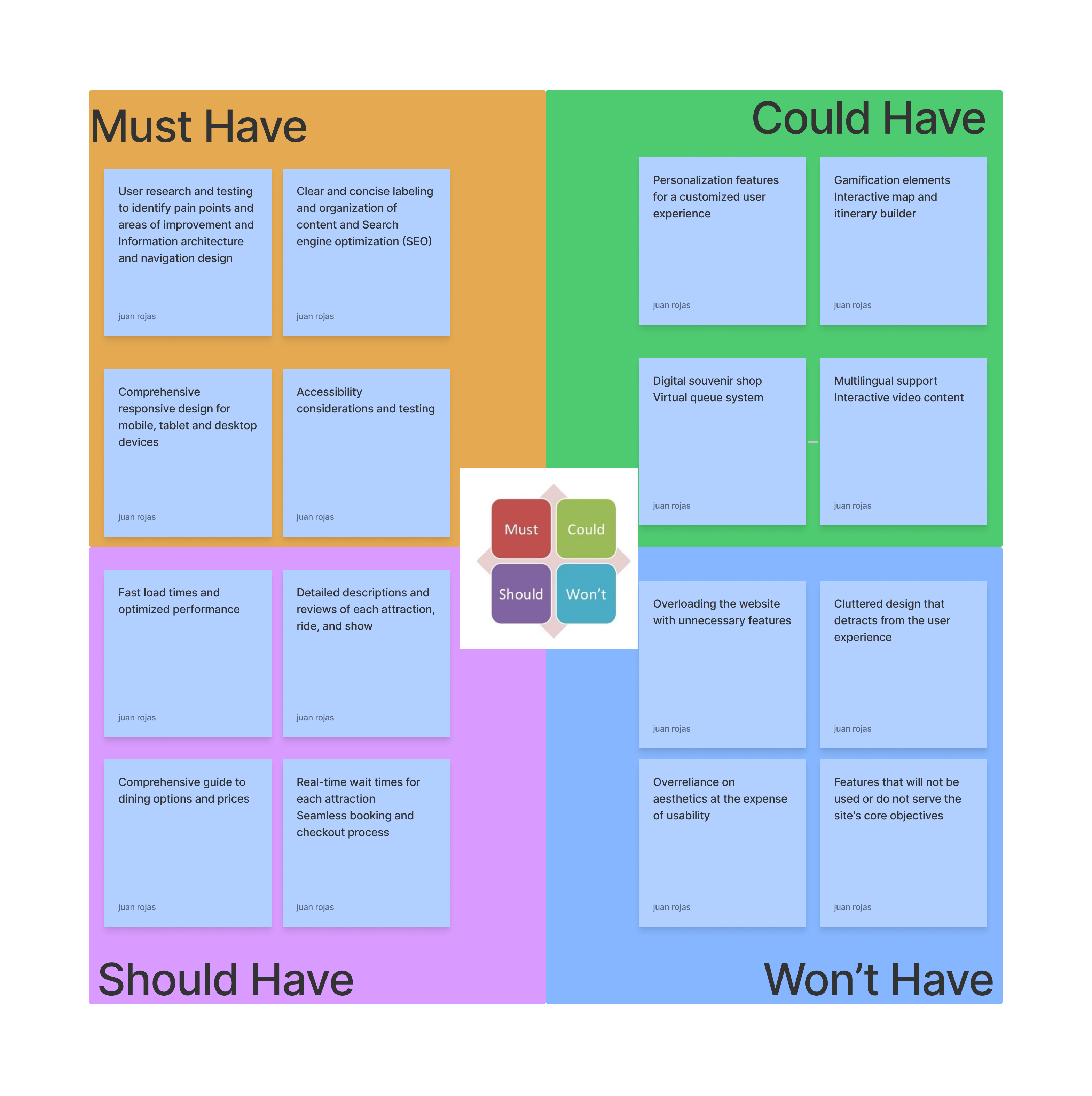
Feature Prioritization Matrix
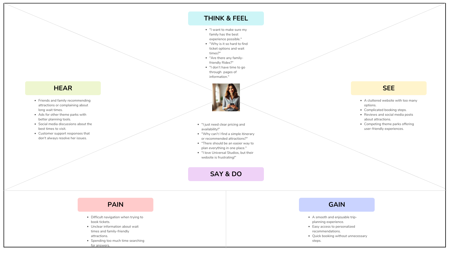
Empathy Map
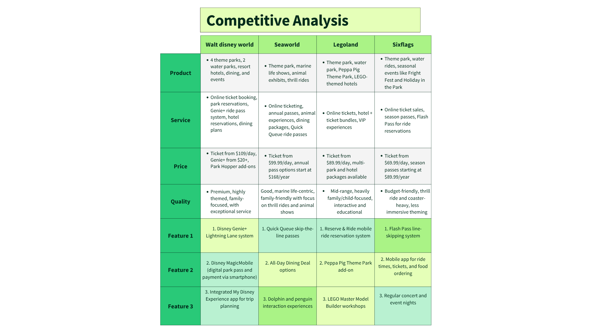
Competitive Analysis
Competitive Takeaways
- Disney: strong storytelling, but booking actions get buried in deep menus.
- SeaWorld: functional and clear, but the visual experience feels generic.
- LEGOLAND: fun branding, but cluttered navigation hurts mobile planning.
- Six Flags: promo overload creates cognitive load and slows key tasks.
Biggest Challenge
- Reduce clutter without losing the excitement and familiarity returning guests expect.
- Rebuild hierarchy so tickets, hours, maps, and planning tools are instantly visible.
- Modernize the UI with improved spacing, typography, and CTA consistency across screens.
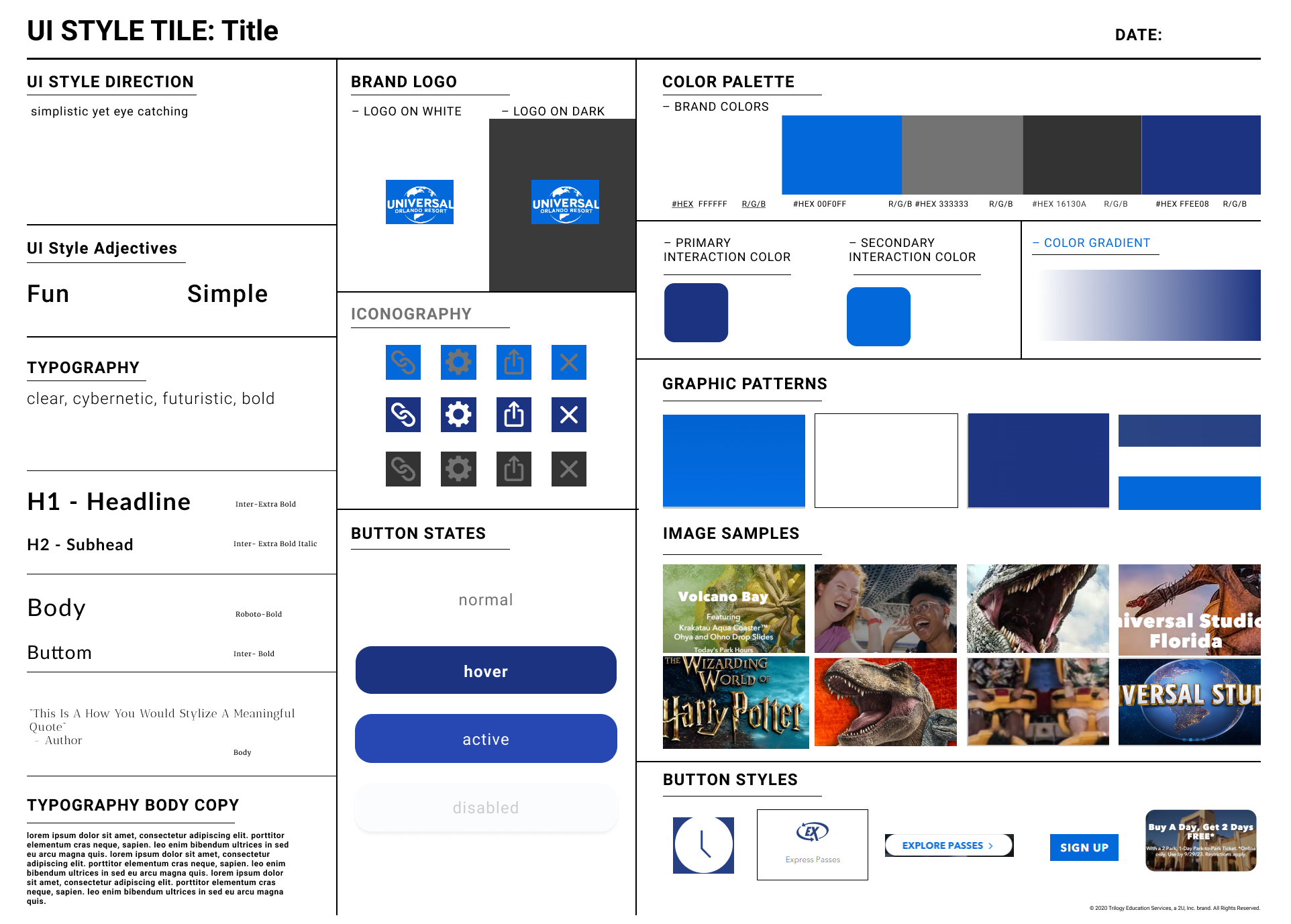
UI Style Guide
Process
- Audit + Competitive Review: identified hierarchy, navigation, and clarity gaps.
- Define Goals: prioritized faster planning and easier booking.
- Wireframes: simplified layout and reduced distractions.
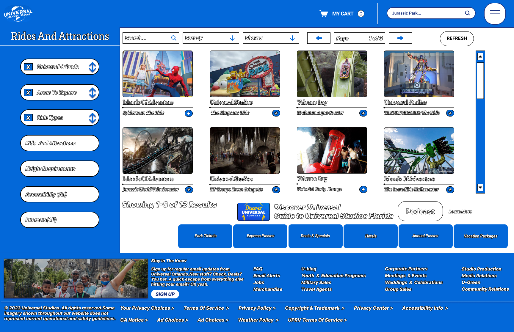
- High-Fidelity UI: improved spacing, typography, and CTA prominence for modern standards.
Wireframe & Design Evolution
Low Fidelity
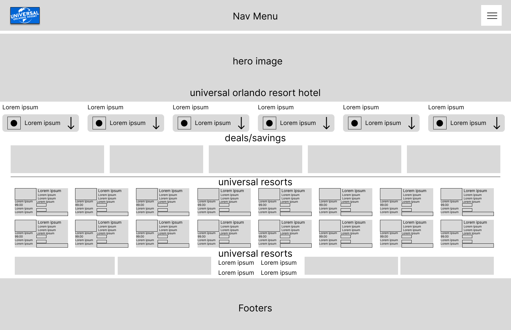
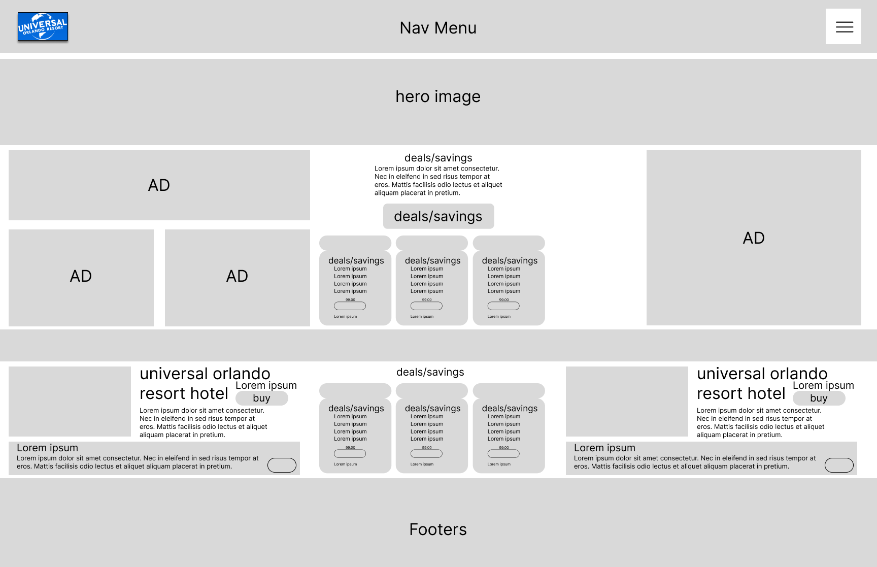
High Fidelity
.png)
Key Design Decisions
As the project evolved, I made several key adjustments to improve usability, enhance guest excitement, and align the site with Universal’s immersive brand experience:
- Added a full-featured hamburger menu with a clear, organized list of options including Theme Park Portal, Universal Immersive Experiences, and direct links to Settings, Help, Language Selection, Contact, and a simplified Login method to improve account access.
- Renamed primary navigation categories to more fun, theme-driven labels that add personality and excitement to the guest experience while retaining clarity and intuitive wayfinding.
- Replaced static hero images with dynamic, tastefully themed imagery and sneak peek visuals of attractions, giving guests an immediate sense of the Universal Studios atmosphere as they browse.
- Completely reorganized the site footer, which was previously cluttered and disordered, into a clean, structured layout with grouped links, social icons, and a consistent All Rights Reserved statement for a polished, professional finish.
- Adjusted color distribution across UI elements to improve visual hierarchy, ensuring CTAs, alerts, and essential information stood out while maintaining a cohesive brand look and feel.
Iteration: First Iteration vs. Final Iteration
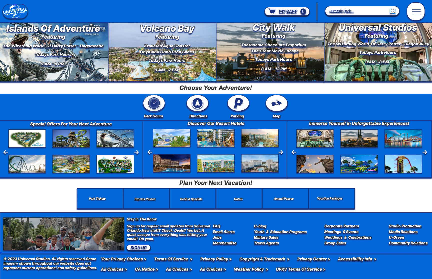
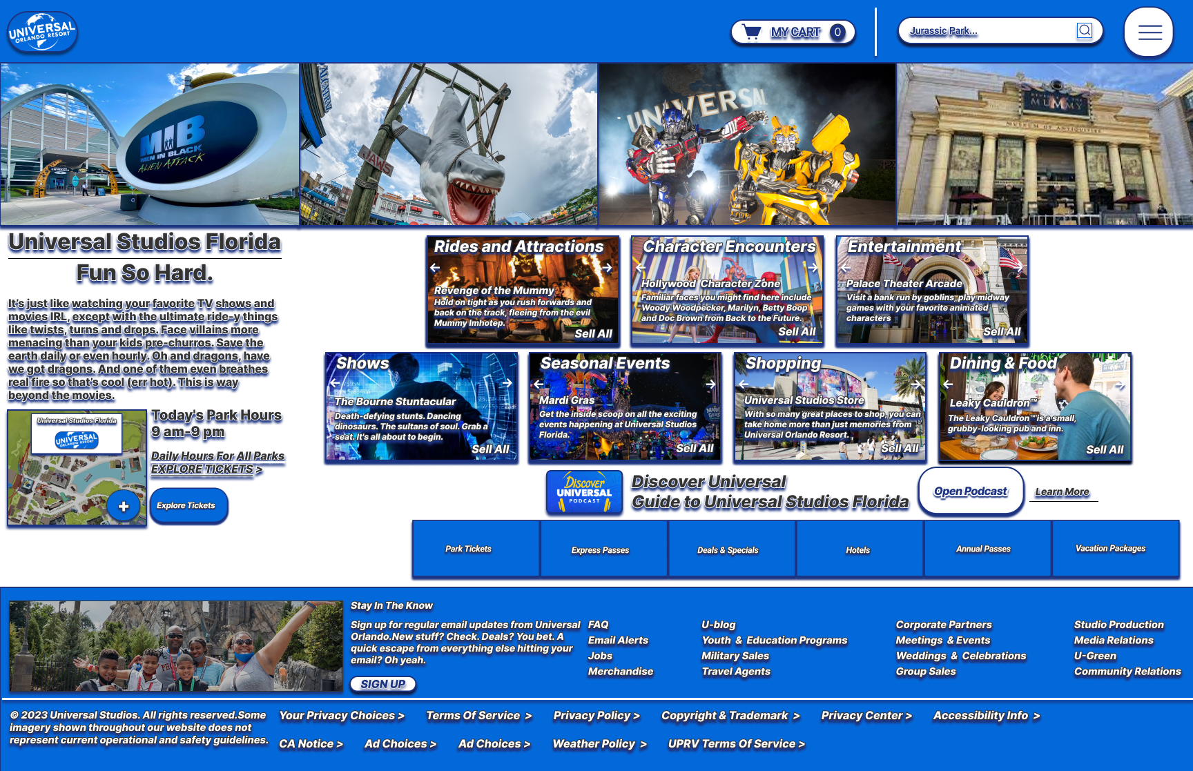
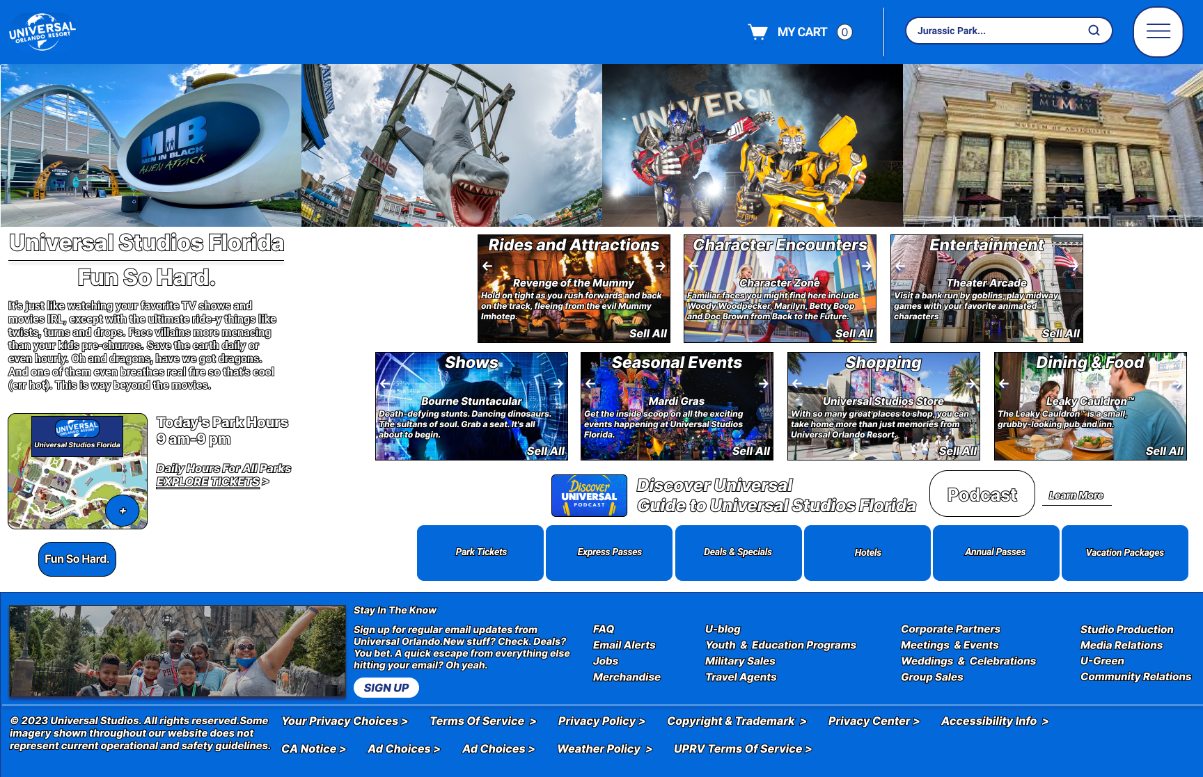
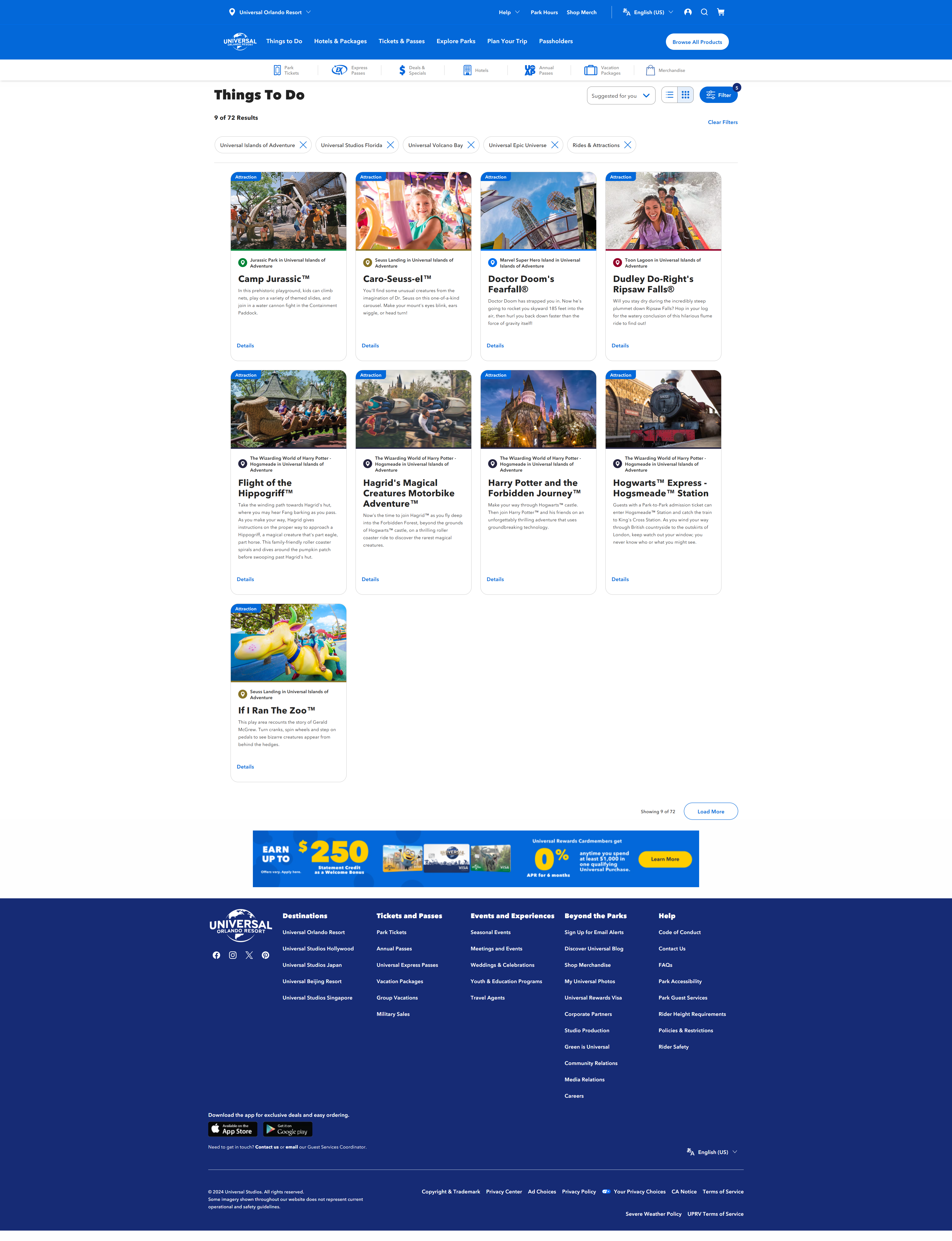
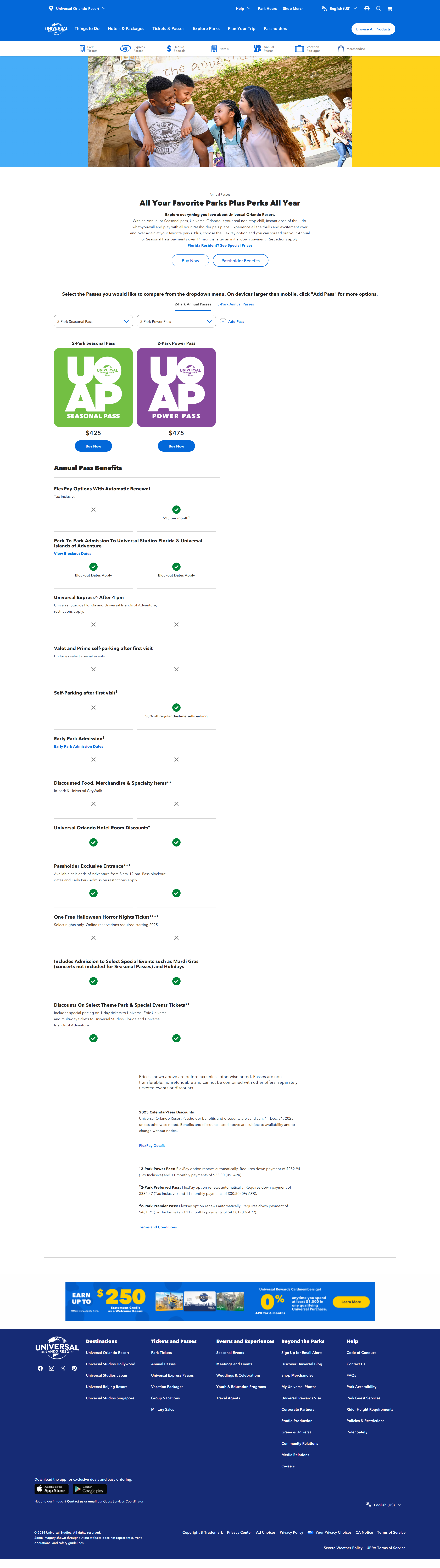
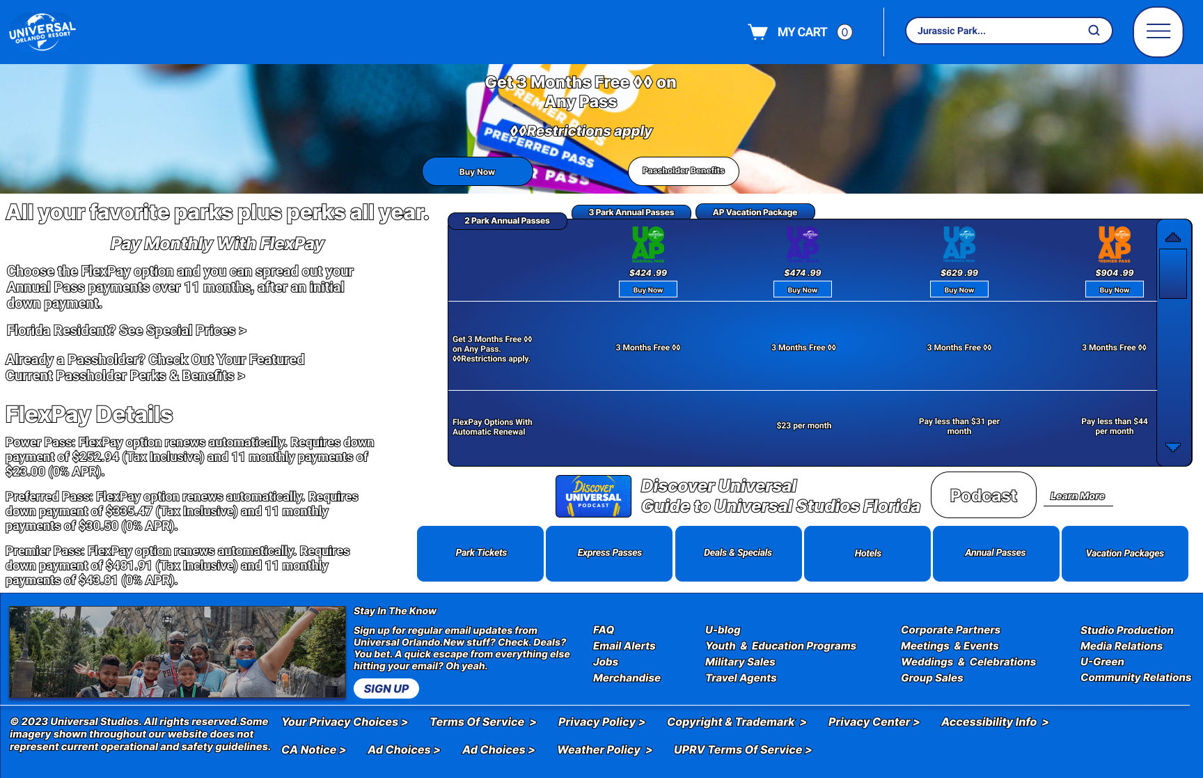
Universal Studios Website vs. My Redesign
A side-by-side comparison of the original Universal Studios website and my modern redesign.
What I Learned
- Balancing Visual Appeal and Usability: Creating a visually engaging website while maintaining clear navigation and easy user flows is crucial for a successful web design.
- Conducting Self-Guided Research: When direct user feedback isn’t available, using personas, competitor analysis, and personal observations helps identify user needs and pain points.
- Iterative Design Process: Refining wireframes and mockups through multiple iterations improves visual hierarchy, spacing, and the prominence of key calls to action.
- Reflecting Brand Identity in UI: Translating the Universal Studios brand into a modern, clean web design that is both professional and playful enhances user engagement and trust.
- Improving Content Structure: Simplifying navigation and organizing content clearly helps users find important information quickly and efficiently.