.png)
.png)
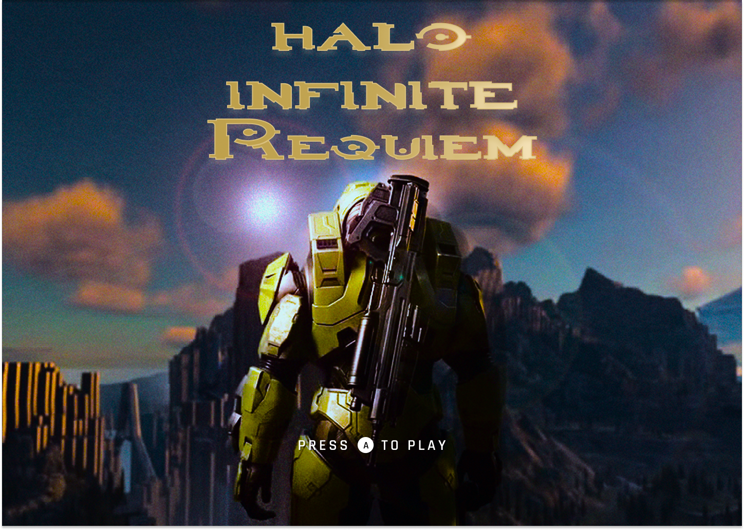
- Project Name: Halo Infinite Requiem (Hypothetical Sequel)
- Role: UX/UI Designer (Solo Designer)
- Tools Used: Figma,Photoshop,Illustrator,Gameuidatabase,dribbble,Behance,
- Timeline: 2 Weeks
- Objective: Expand on Halo Infinite’s foundation by refining gameplay mechanics, improving open-world engagement, and deepening the story. Introduce more biome diversity, richer NPC interactions, and enhanced AI for a more immersive Halo experience.
Halo Infinite Requiem serves as a sequel to Halo Infinite—Halo Infinite Requiem—which expands on the first game while incorporating feedback from the community. The experience would become more dynamic and engaging through UI placement improvements and fixes to menu navigation, layout, and multiplayer variety.
The current UI design and user experience in Halo Infinite presents several pain points that diminish long-term player engagement and satisfaction. From a confusing progression system to repetitive menus and lackluster multiplayer navigation, the game struggles to deliver a modern, accessible, and rewarding experience expected from a flagship title in the franchise.
Challenges with the Existing UI from Halo: Infinite:
- Limited Replayability: Players lack the ability to easily replay campaign missions, reducing long-term single-player value.
- Overcomplicated Progression: Battle Pass systems feel slow and unrewarding, leading to frustration and drop-offs among competitive players.
- Outdated Visual Hierarchy: Inconsistent UI patterns, clunky navigation, and visual clutter create confusion and detract from immersion.
- Weak Customization Experience: Accessing unlockables and personalization options requires navigating a bloated, unintuitive menu system.
Why a Design for a Hypothetical Sequel?
- To deliver a fresh, streamlined, and modernized Halo experience that respects franchise traditions while embracing contemporary UX/UI design principles.
- To increase player satisfaction and retention by refining key systems like multiplayer navigation, mission selection, and progression feedback loops.
- To build a visually cohesive and emotionally engaging experience that unifies story, UI, and player agency in ways that enhance both competitive and narrative-driven gameplay.
Research Snapshot
User
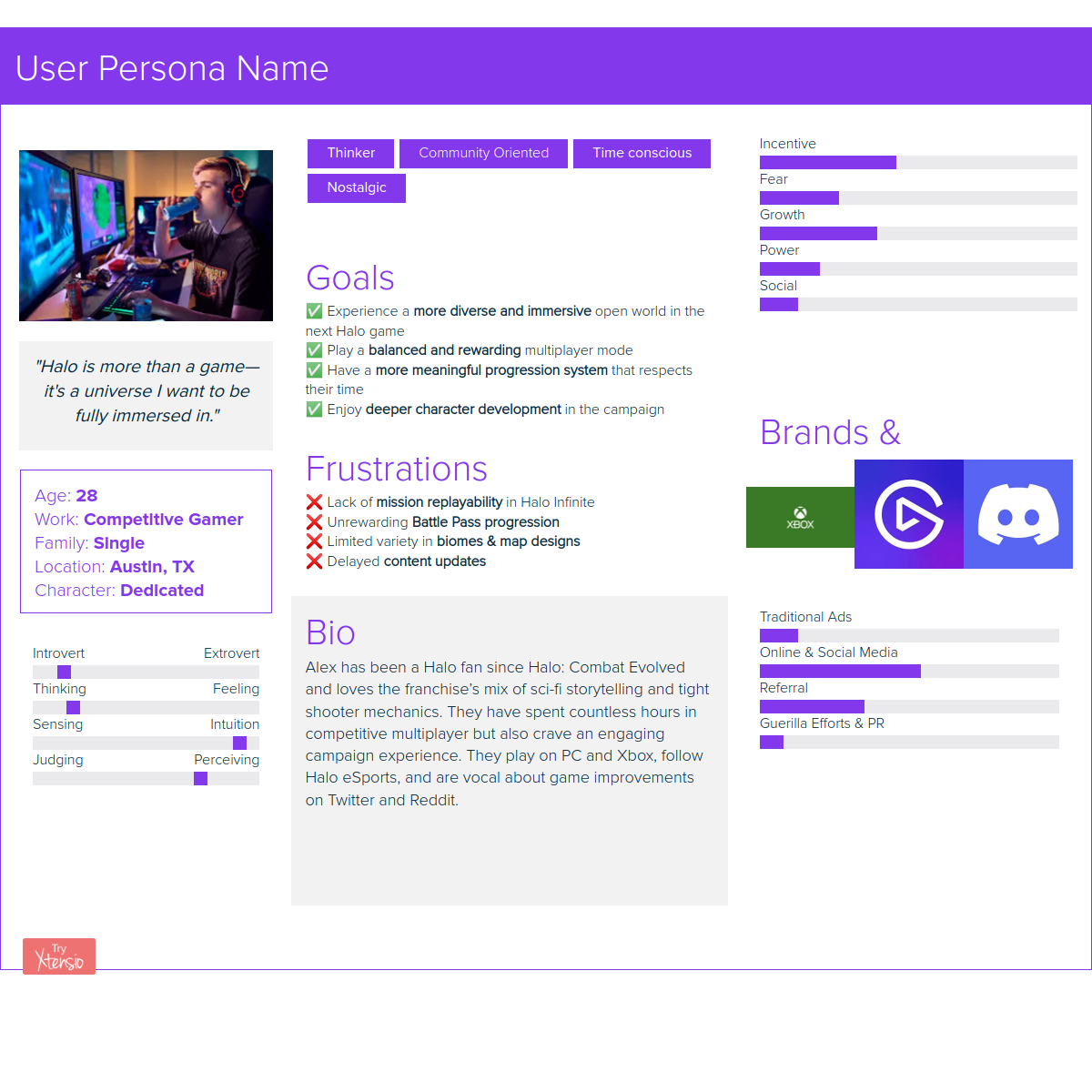
Alex, competitive Halo veteran, wants skill-based rewards, social multiplayer, and a campaign with stronger pacing.
Problem
Progression feels unclear, menus feel bloated, and key actions take too long to reach.
Outcome
Faster time-to-match, clearer rewards, and a more cohesive “single hub” experience across modes.
Impact (Player Outcomes)
Persona
Player Insight
Alex doesn’t need more features, he needs clear rewards, faster access, and a social loop that keeps the squad playing.
Design Strategy & Impact
Reduce Friction
Core actions accessible within 1–2 interactions.
- User Impact: Faster access, smoother flow.
- Outcome: Reduced time-to-match.
Clarify Progression
Transparent, earned rewards with clear tracking.
- User Impact: Clear sense of achievement.
- Outcome: Stronger long-term engagement.
Strengthen Social Play
Modernized tools for faster coordination.
- User Impact: Easier group formation.
- Outcome: Increased session length + retention.
Improve Clarity Under Pressure
Cleaner layouts designed for high-intensity sessions.
- User Impact: Faster decisions mid-match.
- Outcome: Higher player confidence.
Unify the Experience
Seamless transitions across Campaign, Multiplayer, and Customization.
- User Impact: Clear mental model.
- Outcome: Stronger cross-mode engagement.
Competitive Analysis
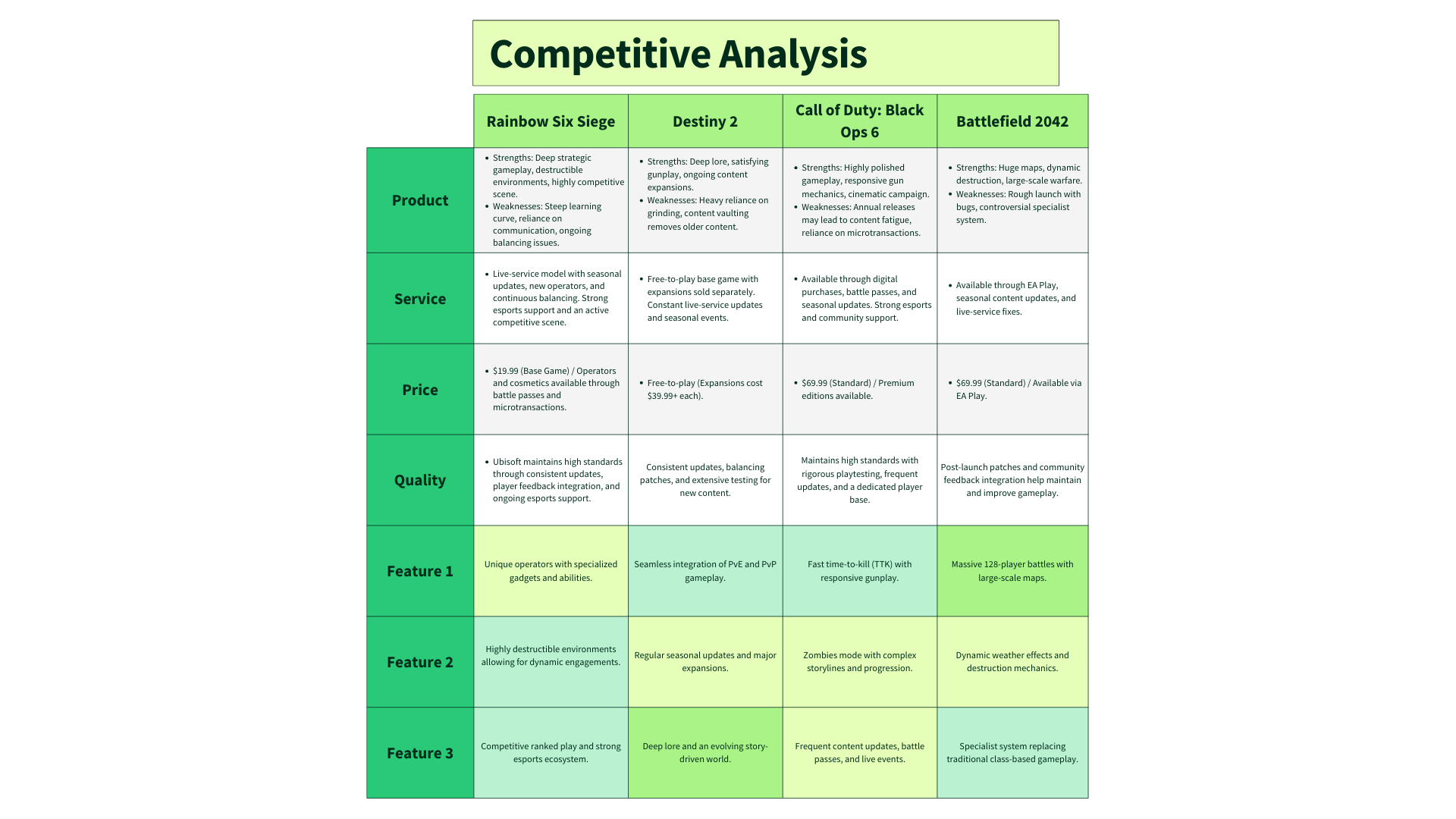
Benchmarking top shooters highlighted three gaps Halo must close: progression clarity, social tools, and customization flow.
Wireframe & Design Evolution
UI & Gameplay Experience Improvements
Based on what Alex — and Halo’s wider audience — has repeatedly asked for, here’s what I prioritized in this redesign:
- Customizable HUD & Accessibility: Give players control over what clutters their screen and how big or bright it appears. It makes intense firefights cleaner and helps more players feel comfortable jumping in.
- Streamlined Menus: Halo’s menus have gotten bloated. I brought it back to basics, putting essential categories upfront while organizing the rest in simple, logical submenus players can actually find mid-match.
- Modernized Matchmaking & Social Tools: Borrowing the clean readability of Halo Reach’s UI with modern filters and custom lobby tools from titles like Apex, this design makes it faster to find good matches or assemble a fireteam.
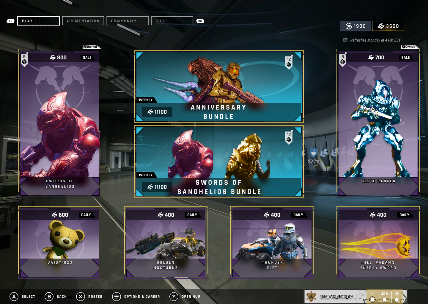
- Store Redesign: Infinite’s current store buries items in tedious scrolling. I reorganized it by category, prioritized visuals and prices, and added quick filters to make finding what you want effortless.
- Armor & Loadout Customization Overhaul: I merged multiple menus into one clean customization hub, cutting down steps to swap armor, adjust loadouts, and equip cosmetics. I also added the option to save class presets for campaign and multiplayer separately.
.png)
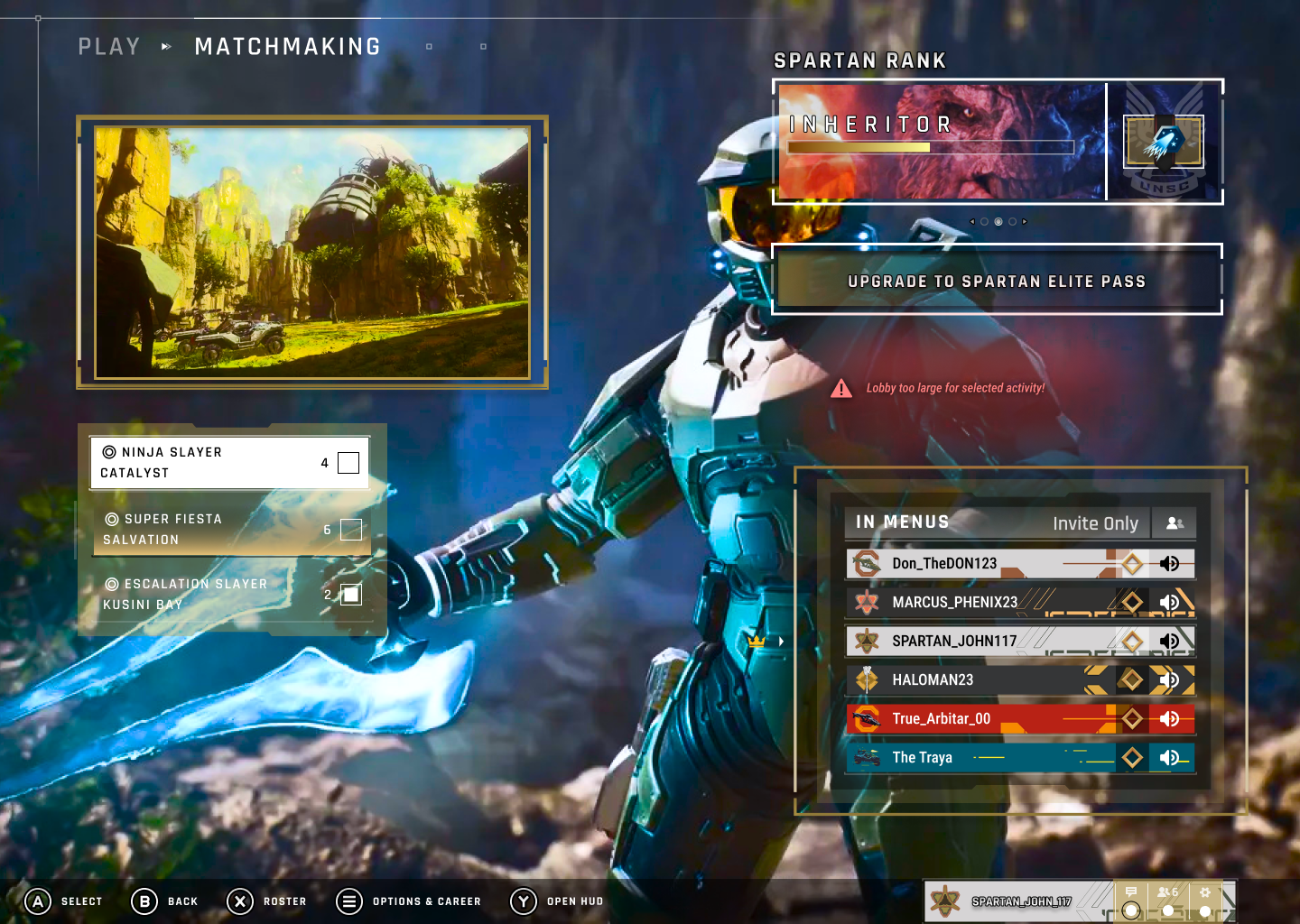
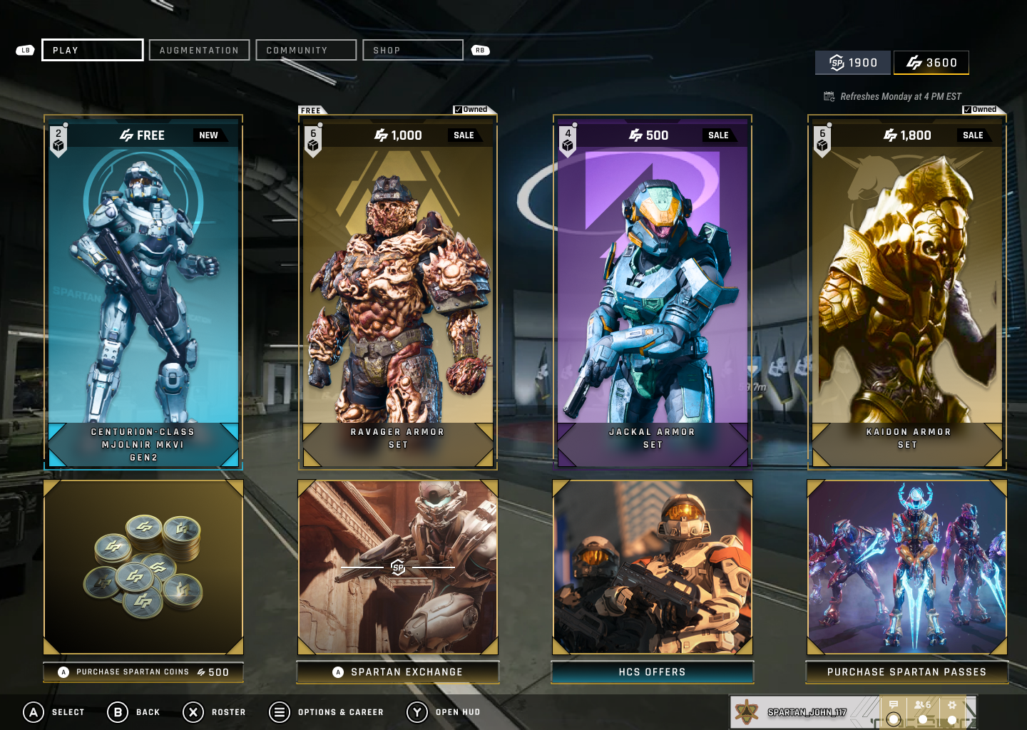
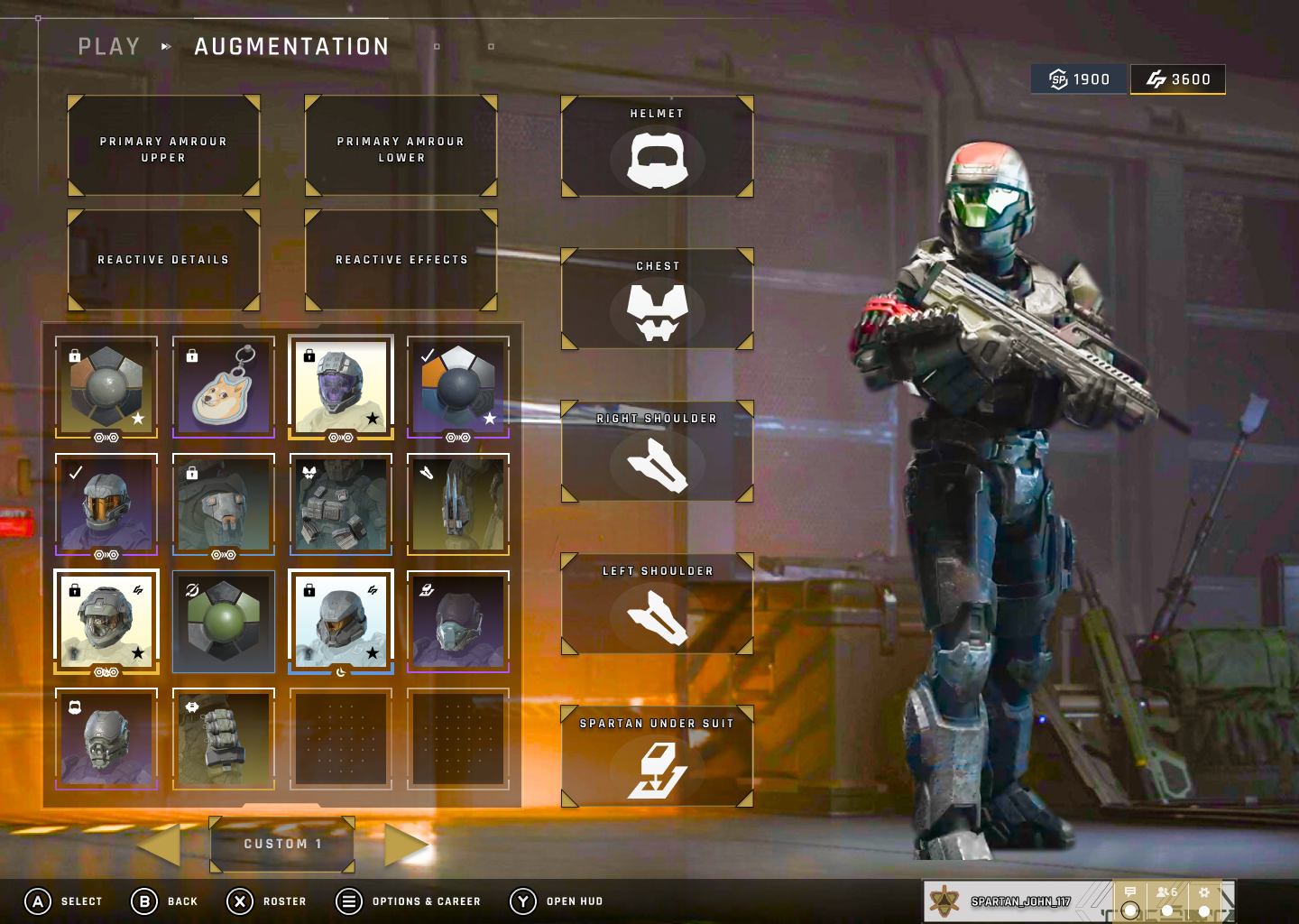
High Fidelity
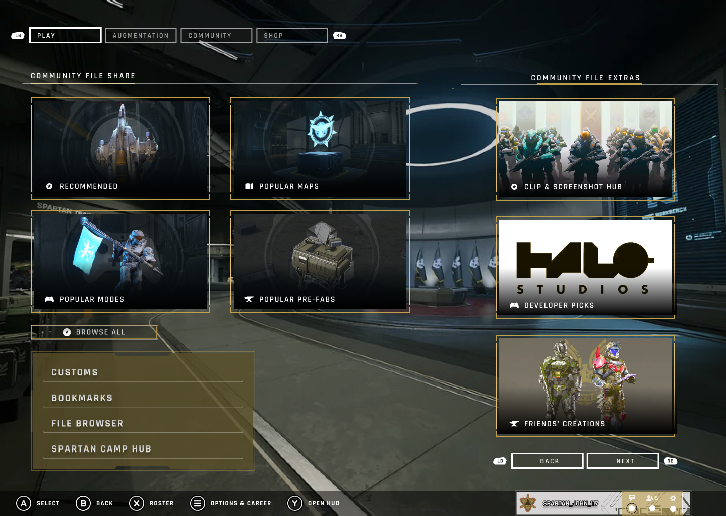
After validating the wireframe structure, I transitioned to high-fidelity designs to enhance visual hierarchy, improve call-to-action clarity, and align the UI with the modern sci-fi aesthetic of the Halo universe while addressing player pain points identified in competitor analysis.
Iteration: First Iteration vs. Final Iteration
Between the first and final iterations, I addressed issues with color scheme consistency, integrating thematic, sci-fi-inspired hues to enhance visual flow and screen balance. I improved weak button visibility, refined the background image to better serve as an immersive, in-game main menu backdrop, and selected new typography that aligns more closely with the futuristic aesthetic of the Halo universe. These adjustments created a more cohesive, readable, and engaging experience for players navigating the UI.
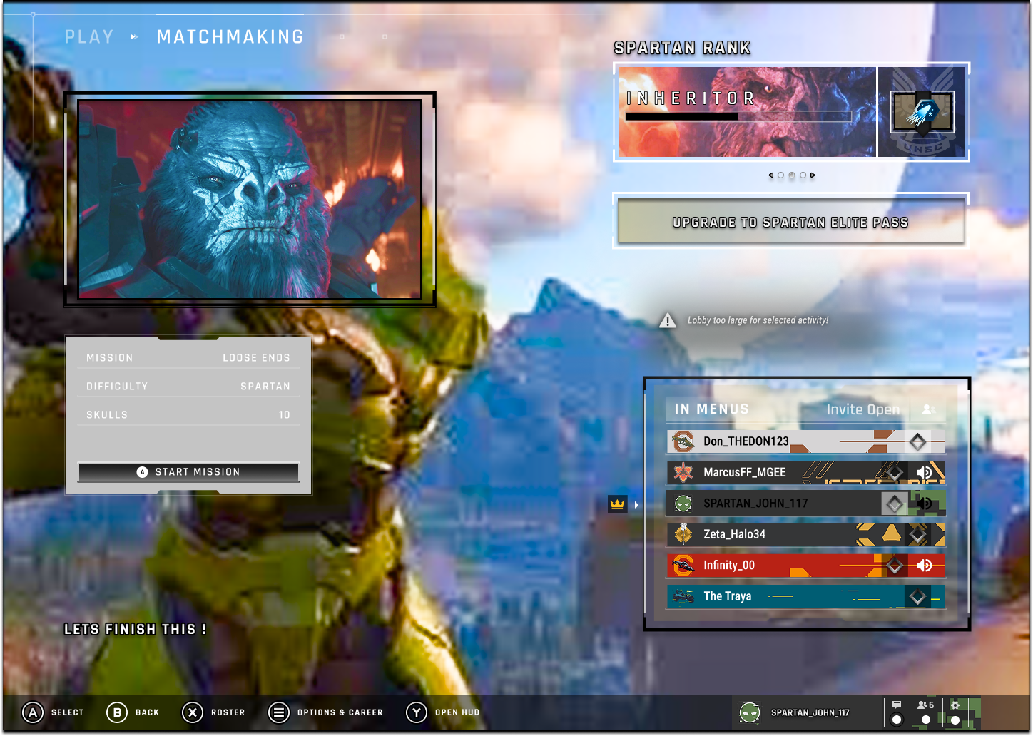
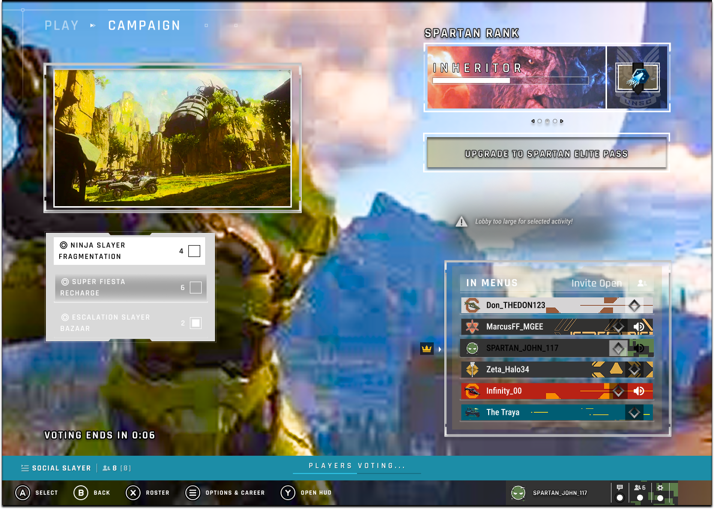
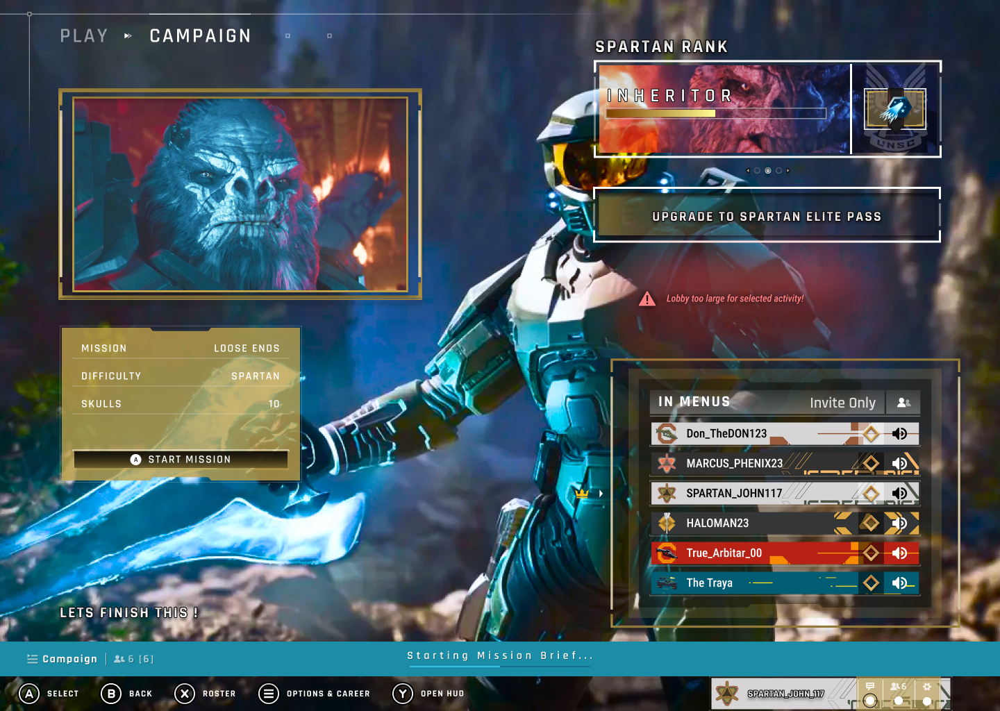
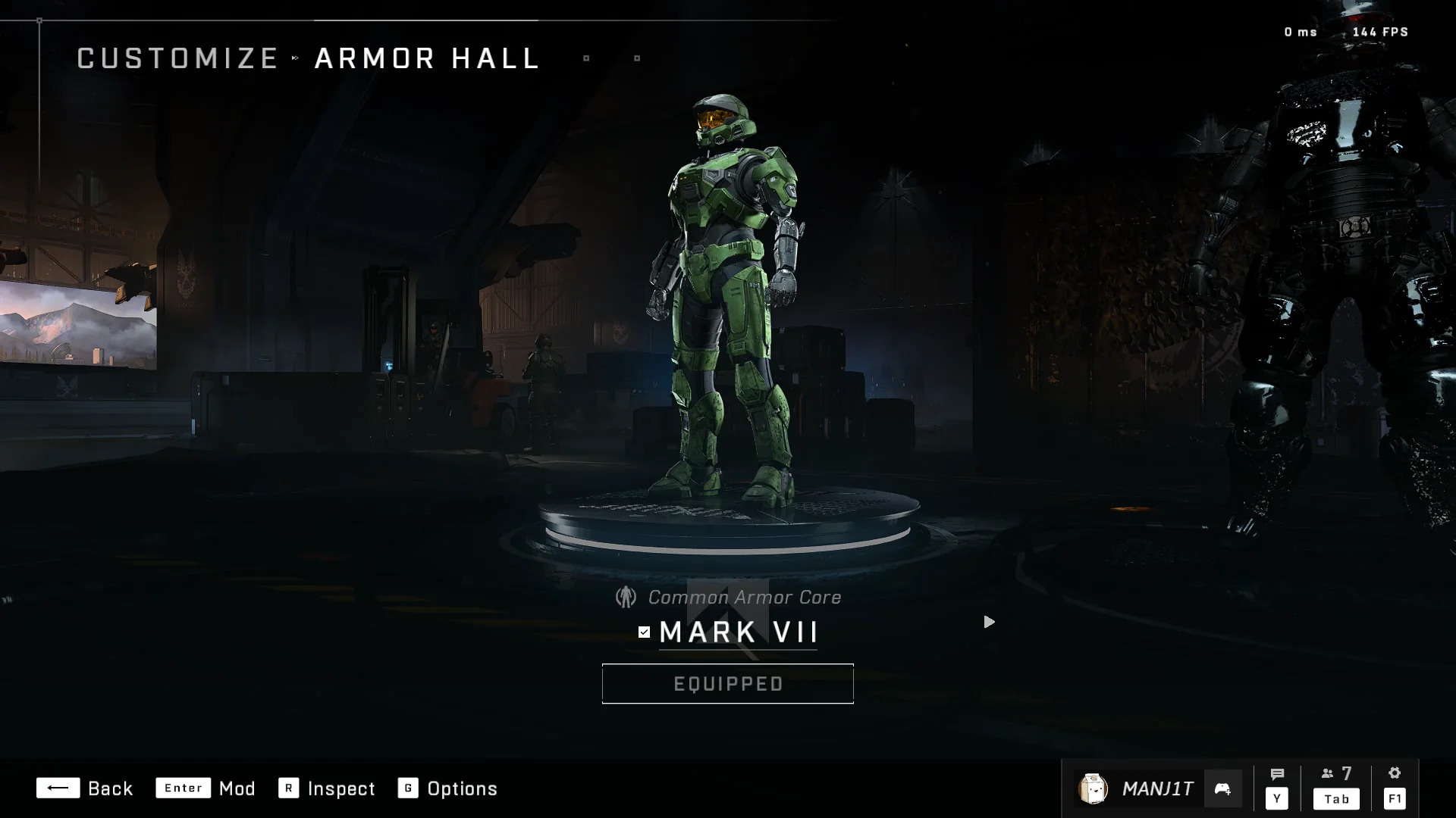
Halo Infinite vs. Halo Infinite Requiem
A side-by-side comparison of the original Halo Infinite and my hypothetical sequel, Halo Infinite Requiem.
22.webp)
What I Learned
- Designing for Complex Systems: I learned how important it is to simplify layered game systems (progression, customization, matchmaking) without removing depth for players.
- Adapting Competitor Insights: Analyzing games like Rainbow Six Siege, Destiny 2, and Call of Duty showed me how different approaches to progression and UI structure can inspire Halo’s unique solution without copying competitors.
- Iterative UI Refinement: Multiple wireframe and mockup iterations were critical to creating cleaner navigation, better menu organization, and a more cohesive user flow.
- Balancing Nostalgia with Modern UX: Retaining Halo’s legacy design elements while updating visuals and interactions for modern players was key to user trust and engagement.
- Clarity in High-Stakes Contexts: I learned how crucial clear visual hierarchy, responsive feedback, and fast navigation are during competitive multiplayer experiences where every second counts.